
Navigating a vehicle’s infotainment system while driving presents a constant design challenge, balancing rich functionality with the absolute necessity of minimizing driver distraction. A single tap that takes a fraction of a second too long to complete can have significant consequences, transforming every element of the user interface into a critical component of automotive safety. In response to this ongoing challenge, recent analysis of Android Auto’s latest software build indicates that Google is preparing to implement a subtle but meaningful visual update focused on the media playback experience. The core of this change is the introduction of a new progress bar for music and podcast applications, directly affecting a feature that drivers interact with frequently. This forthcoming alteration is more than a simple aesthetic refresh; it represents a thoughtful evolution in interface design that aims to make media controls not only more visually appealing but also fundamentally easier and safer to use for drivers on the road.
A Shift in Design Philosophy
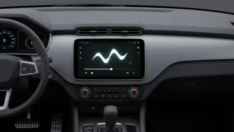
The primary theme of this update is a noticeable shift in user interface design, moving away from the stark minimalism of previous versions. The current flat, linear progress bar, a standard and unobtrusive element, is slated to be replaced by a far more dynamic, wavy-shaped bar that adds a sense of motion and fluidity to the media player. This new design is not an arbitrary change but is directly derived from Google’s Material 3 “Expressive-style” guidelines, which champion more animated and personalized interfaces. This visual language is already present on Google’s Pixel smartphones, and its integration into Android Auto signifies a concerted effort to create a more cohesive and unified design language between the in-car system and the broader Android mobile operating system. By adopting this wavy aesthetic, Google is aiming to give media controls a more playful and modern feel, signaling a departure from purely utilitarian design toward an experience that is more visually engaging for the user.
This push for visual unity is a key aspect of Google’s current software strategy, which seeks to create a seamless and familiar experience for users across all their devices. When a user transitions from their smartphone to their vehicle’s dashboard, a consistent design language can reduce the cognitive load required to navigate different interfaces, making interactions feel more intuitive and natural. The introduction of the wavy progress bar is a prime example of this strategy in action. While it may seem like a minor cosmetic tweak on the surface, it represents a deliberate step in an overarching trend of modernizing the Android Auto platform. This effort ensures that the in-car experience does not feel like a technologically dated offshoot but rather a fully integrated and contemporary extension of the user’s personal digital ecosystem, reflecting the latest design trends being implemented across Google’s entire product portfolio.
Enhancing Usability and Driver Safety
Beyond its modern aesthetics, the new design for the media progress bar was identified as having a significant practical benefit that directly addresses driver safety. An analysis of the feature revealed that the wavy progress bar appears to be visibly thicker and more pronounced than its slender, linear predecessor. This increase in size and distinct, undulating shape is crucial for improving usability in a dynamic driving environment. It effectively creates a larger and more forgiving touch target, which could make it substantially easier for drivers to interact with, particularly for the common action of “scrubbing” (fast-forwarding or rewinding) through a song or podcast. In a moving vehicle, where a driver’s hand may not be perfectly steady, a larger target requires less fine motor precision, potentially reducing the time and mental effort needed to perform the action successfully on the first attempt, thereby contributing to a safer driving experience.
This improvement in tactile usability directly translated to a reduction in potential driver distraction. By simplifying a frequent interaction, the design allowed drivers to keep their focus on the road for longer periods. The discovery of this feature, while not yet available to the public, was found within the application’s code, indicating it was in an advanced stage of development for a future release. The change represented a clever fusion of form and function, where a stylistic choice rooted in Google’s Material 3 design philosophy also served a critical ergonomic purpose. The wavy progress bar was not merely a cosmetic update; it was a thoughtfully engineered enhancement that acknowledged the unique challenges of in-car user interface design, prioritizing ease of use and safety without sacrificing a modern and engaging visual appeal. This development demonstrated a mature approach to platform evolution, where even the smallest interface elements were reconsidered to improve the overall user experience.