
I’m thrilled to sit down with Oscar Vail, a renowned technology expert whose pioneering work in emerging fields like quantum computing, robotics, and open-source projects has positioned him at the cutting edge of innovation. Today, we’re diving into his insights on Datavzrd, a groundbreaking open-source tool developed to simplify the visualization of complex data. Our conversation explores how this tool transforms raw data into user-friendly, interactive reports, its accessibility for non-technical users, and its potential to revolutionize data analysis across diverse fields like medicine and archaeology. Join us as Oscar unpacks the vision behind Datavzrd and its impact on making data more intuitive and sustainable.
How did the idea for Datavzrd come about, and what gap in data analysis were you aiming to fill with this tool?
The idea for Datavzrd emerged from a frustration with how cumbersome it can be to make sense of complex tabular data, especially in scientific fields where data sets are often massive and intricate. At its core, we wanted to address the challenge of turning raw, hard-to-read tables into something actionable and understandable without requiring advanced technical skills. Many existing tools either demanded programming expertise or specific software, which created barriers for a lot of potential users. Our goal was to democratize data visualization, making it accessible to researchers, educators, and professionals across disciplines.
What makes Datavzrd’s approach to visualizing data different from traditional methods or even other modern tools?
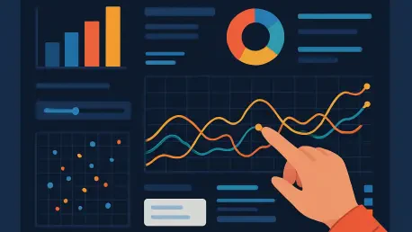
Unlike traditional methods where data is often stuck in static tables with no interactivity, Datavzrd transforms these into dynamic HTML reports that users can filter, sort, and explore in a browser. Compared to other tools, our focus was on simplicity and low maintenance. You don’t need to install anything special or know how to code. The visual elements and controls are designed to be intuitive, so users can dive into the data with ease, whether they’re looking at broad trends or specific details.
Can you walk us through how Datavzrd ensures accessibility for people without programming experience?
Absolutely. One of the core features of Datavzrd is that it uses a straightforward text file to configure reports. Think of it like writing a simple set of instructions— you describe how you want the data to be displayed, and the tool takes care of the rest. This eliminates the need for coding or complex software setups. We’ve also included tutorials to guide new users, so even if you’ve never worked with data visualization before, you can get started pretty quickly with minimal learning curve.
I understand that Datavzrd allows reports to be shared easily via email or opened in a browser. How does it maintain interactivity in these formats?
That’s one of the strengths of Datavzrd. The reports are built as HTML files, which means they’re fully functional in any standard web browser without needing additional plugins or software. When you share them via email or as attachments, all the interactive features—like filtering or navigating through linked data—stay intact. This portability ensures that collaborators or stakeholders can engage with the data just as you intended, no matter where they are.
How does Datavzrd handle complex relationships between multiple data tables, and why is this important for users?
Datavzrd is designed to map out intricate connections between different data sets, which is crucial when you’re dealing with hierarchical or related information. For instance, it allows users to navigate through data layers or link entries across tables, making it easier to see how pieces fit together. In practical terms, this means a researcher can jump from a patient’s genetic data to related therapy options in a medical context, or an archaeologist can compare artifacts from different sites seamlessly. It’s about providing context and clarity in a way that static tables just can’t.
Can you share a specific example of how Datavzrd is being applied in a real-world scenario, like in medicine or archaeology?
Sure, let’s take the medical field as an example. In a molecular tumor board, Datavzrd is used to present patient-specific genetic findings and potential therapy options interactively. Doctors can filter through the data to focus on what’s relevant for a particular case, explore connections between genetic markers and treatments, and make informed decisions right from the report. It streamlines the process significantly, turning what could be hours of sifting through spreadsheets into a much more efficient, visual experience.
What do you see as the biggest advantage of Datavzrd over other data visualization tools out there?
I’d say it’s the combination of user-friendliness and sustainability. Datavzrd doesn’t require ongoing maintenance or specialized technical knowledge, which sets it apart from many alternatives that can be resource-intensive to manage. Users can create and share reports without worrying about compatibility issues or software updates. While there might be trade-offs in terms of advanced customization compared to some coding-heavy tools, the accessibility and ease of use make it a game-changer for a wide audience.
What challenges did you and your team face while developing Datavzrd, and how did you overcome them?
One of the biggest challenges was striking the right balance between simplicity and functionality. We wanted a tool that was easy to use but still powerful enough to handle large, complex data sets. There were technical hurdles in ensuring the HTML reports remained interactive even with millions of rows of data, which required a lot of optimization. Through iterative testing and feedback from early users, we refined the design to make sure it was both robust and intuitive, keeping the end user’s experience at the forefront.
Looking ahead, what is your forecast for the future of tools like Datavzrd in data visualization and analysis?
I think we’re just at the beginning of a shift toward more accessible, user-centric data tools. As data continues to grow in volume and complexity across all fields, there’s going to be an even greater demand for solutions like Datavzrd that break down barriers to entry. I foresee these tools becoming more integrated with collaborative platforms, allowing real-time data sharing and analysis on a global scale. My hope is that we’ll see a future where anyone, regardless of technical background, can harness the power of data to drive insights and innovation.