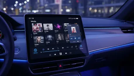

The evolution of in-car interfaces represents a delicate dance between rich functionality and the absolute necessity of driver safety. As a veteran in the automotive software space, I have watched the industry shift from rigid, text-heavy lists to the more dynamic, visual experiences we see in the latest Android Auto updates. With the release of the Car App Library enhancements, developers finally have the tools to create immersive environments that feel integrated into the vehicle rather than just projected onto it. This shift marks a significant milestone in how we approach the digital cockpit, moving away from “one-size-fits-all” templates toward a more nuanced, brand-forward design philosophy.
How do you balance the need for increased design flexibility with the strict safety standards required for driving interfaces? What specific challenges do developers face when implementing complex layouts like spotlight sections while trying to minimize driver distraction?
The primary challenge lies in the cognitive load; every millisecond a driver spends looking at a screen is a millisecond they aren’t looking at the road. To balance flexibility with safety, we utilize the new spotlight sections in scrollable areas to draw the eye quickly to high-priority content, reducing the need for deep menu diving. My design process begins with a strict hierarchy of information, followed by “glance-testing” where we ensure a user can grasp the intent of a layout in under two seconds. We then implement the new Car App Library templates to ensure that even as we add visual flair, the underlying structure adheres to the 17.0 beta safety guardrails. Finally, we iterate using real-world driving simulators to ensure that the spotlight sections don’t create “visual “gravity” that pulls the driver’s attention away from the windshield for too long.
New navigation tools like adaptive mini-players and “Chip” components are arriving for media apps. How do these additions change the way users interact with long-form audio during a commute, and what technical steps are required to integrate these components into diverse dashboard architectures?
The introduction of the adaptive mini-player is a game-changer for long-form content because it allows users to browse their libraries without losing control of their current playback. In the past, switching from a podcast to a music playlist required multiple taps that obscured the “pause” or “skip” buttons, but this new component maintains that control persistently. Technically, integrating these requires developers to map their app’s state to the new CondensedItem and Chip components, which act as high-density touch targets that work across various screen resolutions. We have to ensure our backend can feed these smaller components the right metadata—like “Live” tags or “Unplayed” badges—so the user gets a full status update at a single glance. It’s about moving from a “full-screen or nothing” mentality to a modular system that respects the limited real estate of a dashboard.
Grid item variations and visual headers now allow for more diverse content presentation across different car displays. What are the UI trade-offs when choosing between these different templates, and how can a developer ensure a consistent brand experience across various vehicle screen sizes and aspect ratios?
The main trade-off is between information density and legibility, especially when dealing with the wide variety of aspect ratios found in modern vehicles. While a grid variation might look stunning on a horizontal 12-inch display, it can become cramped on a smaller, vertical screen, so we rely on the increased adaptability of the new templates to reflow content automatically. To maintain brand consistency, we use the new visual headers to inject the app’s unique color palette and iconography without breaking the standardized layout that drivers are already familiar with. It’s a matter of using the “Spotlight” sections to showcase the brand’s editorial voice while letting the underlying Android Auto framework handle the heavy lifting of scaling. By leveraging these 17.0 beta tools, we can ensure that a user opening an app in a budget compact car gets the same premium feel as someone in a luxury SUV.
Major platforms like Spotify and YouTube Music are already testing these revamped library templates. What can smaller developers learn from these early-access implementations, and what specific engagement metrics should they monitor to gauge whether a redesign actually improves the in-car user experience?
Smaller developers should look closely at how giants like Spotify and YouTube Music use the “Chip” and “CondensedItem” components to simplify complex navigation paths. One key takeaway from these early implementations is the importance of reducing “scroll fatigue”; if a user has to scroll more than three times to find a song, the UI has failed. To measure success, developers should monitor “Time-to-Play”—the duration between the app opening and the audio starting—as well as the frequency of “Re-engagement Taps” on the mini-player. If we see a 15% to 20% reduction in interaction time, we know the new templates are doing their job of keeping the driver focused on the road. It’s not just about how many people use the app, but how little effort they have to expend to get the content they want.
What is your forecast for the evolution of in-car infotainment systems?
I believe we are moving toward a “zero-UI” future where the interface becomes almost entirely predictive and context-aware. With the foundation being laid in the Android Auto 17.0 beta and the upcoming I/O 2026 features, we will see apps that don’t just wait for input but proactively use the new spotlight and grid templates to suggest the perfect playlist or podcast based on the time of day, the driver’s destination, and even the current traffic conditions. Eventually, the manual browsing of libraries will be seen as a relic of the past, replaced by a highly personalized, glanceable stream of content that requires near-zero physical interaction. The ultimate goal is an interface that feels like a co-pilot—one that knows exactly what you want to hear before you even have to reach for the screen.